Personalized Documentation

File Icon/overviews/Dev-Notes
The front page of a Dev Notes instance with a basic header, a simple form, a section with a Tag filters and search, and two placeholder example notes that had been saved below. The header has one link called Dev Notes. The form has one submission button and four fields: a basic text field called Topic, a larger textarea field called Solution, an autocompleting select field to add additional Solutions, an additional autocompleting select field to create or add Tags. The submission button at the bottom currently displays the error: A Topic is required to create a Note. Only the titles and Tags of the two placeholder notes can be seen. One of which is Tyrannosaurus with the Tag Cretaceous, and the other is Camarasaurus with the Tag Jurassic.
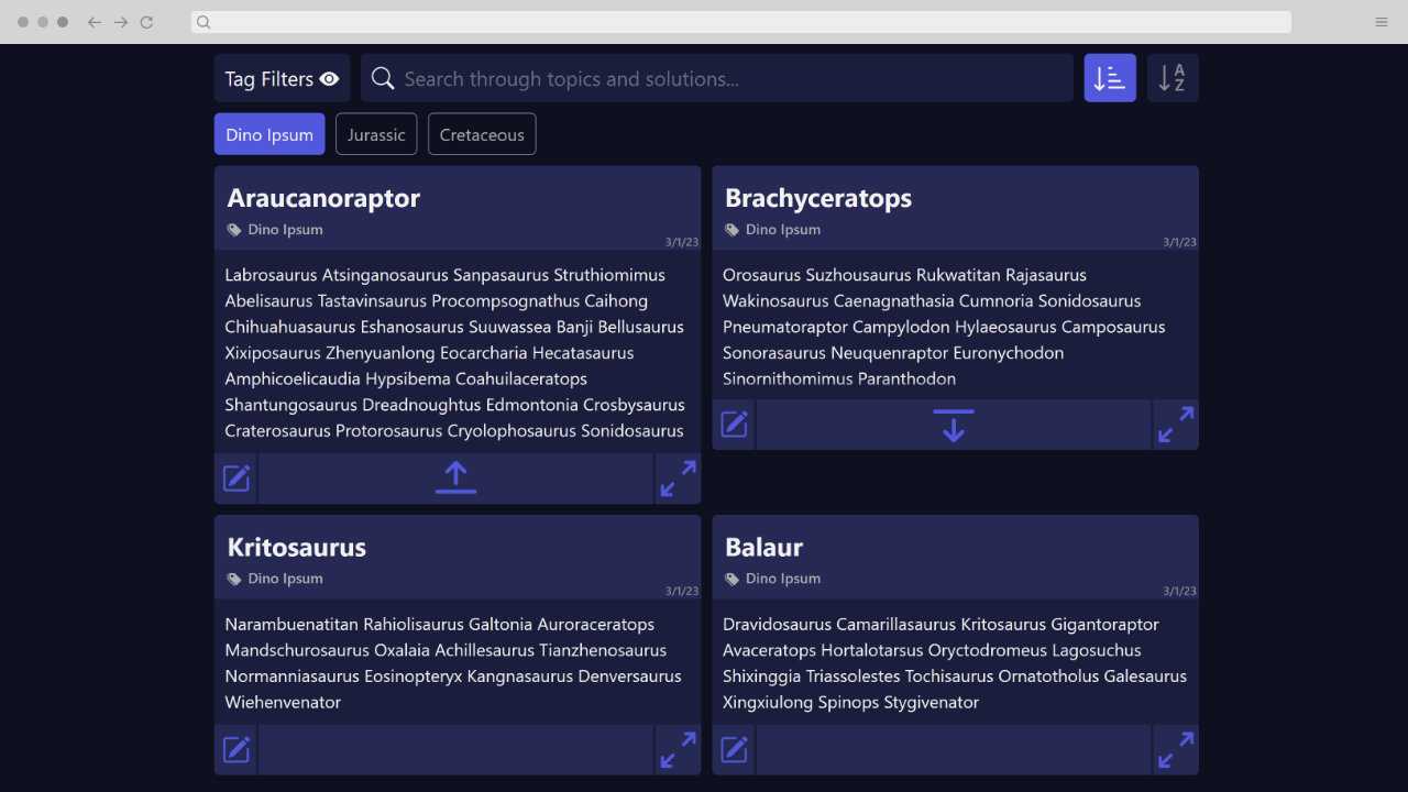
Another view of the front page of a Dev Notes, this time highlighting three Tag filters, and four example notes. The Tag filters are Dino Ipsum, Jurassic, and Cretaceous.. All of the text in the Notes are randomly generated real and fake dinosaur names. Each of the four Notes are are roughly the same size, and they all look very similar to the wireframes described earlier. The only addition is a new middle button in the actions at the bottom of a note. This new button is an icon with an arrow implying to expand or collapse the note vertically. The only note out of the four that stands out in any relevant way is the first one, as it's the only one that has been vertically expanded, thus making it the longest
Info
  • Solo Project
  • Project Launch, 2022
  • ~15 Minute Read
  • Dev Notes Demo
Role
  • UI / UX Designer
  • Web Developer
Tools
  • Figma
  • CSS
  • React / JavaScript
  • Node.js

As a developer, I often find myself searching for the same solutions over and over again, but documenting how I've solved difficult problems has been immensely helpful. That being said, documenting what I've already solved isn't the most exciting work, and I struggle to do it if it's not excessively convenient. I created Dev Notes to hit the specific balance I wanted between simple note taking, but detailed enough to find the notes when I needed them.

Some Explanation

Prior to making Dev Notes, I had a giant google doc that I would add previously solved solutions to, and used Ctrl+F to find them. It did the job okay, but I didn't like how it looked and it was becoming quite difficult to maintain. I figured there had to be a tool that I could replace it with, but I found myself having either of these two complaints:

  • The tool was too simple, making it difficult to find solutions again.
  • The tool was too complex, so while it might be easy to find solutions when I needed them, I'd never take the time to save solutions in the first place.

Browser Bookmarks, for example, are the fastest method of saving a link, which does a good job at saving most solutions. But with only a single text field to describe the link there's a slim chance you'll always remember which links are for which solutions. On the other end, Wordpress allows a blogpost worth of detail, and has loads of free plugins and themes; all of which would make for an easy solution if not for the unavoidably large amount of time and input it takes to navigate between viewing and saving content. After I felt I had adequately — but unsuccessfully — hunted for the right tool, I decided to make my own. I wanted a tool that:

  • allowed for saving solutions on the same page they were viewed.
  • allowed solutions to be detailed enough to be easily found when they're needed.
  • presents solutions in a simple format with a color palette I liked.

Defining A Note

My biggest complaint about my large Google doc was having to rely on headings to separate content, which limited my ability to organize the doc effectively. Most of the time, this was not an issue because I could search the doc for what I wanted to find. However, I could not always rely on myself to quickly write solutions in a way that I would remember how to find later. I tried to categorize my solutions into separate sections of the doc, but this meant I had to scan the doc for the best place to add a new solution, making the process significantly less convenient. From this, I concluded that having a pre-defined set of fields for each entry of content would be better. I called these individual content entries Notes. Here are the fields of a Note that I ended up sticking with:

  • Category - Every Note belongs to a Category. To minimize the input required to save a new Note, the user creates and selects a Category before they are able to save a new note.
  • Topic - the title of a Note.
  • Solution - the body text field that contains the Solution of a topic.
  • Tags - The only optional field of the bunch. Tags are available to further assist in organizing topics and give an alternative method to find Solutions in case I knew I had a Solution, but couldn't recall what its Topic was.

From there I made some wireframes to envision how this might look:
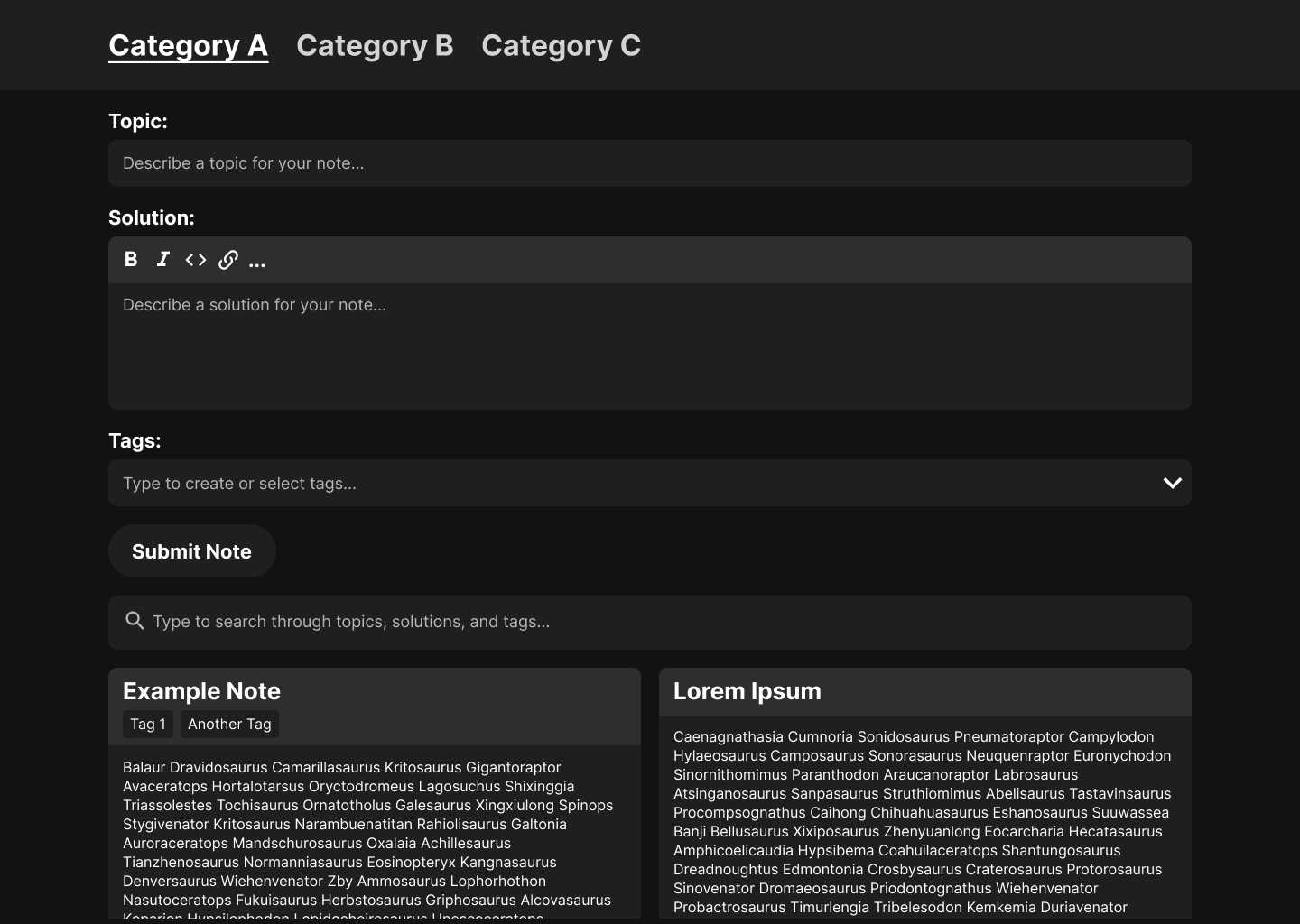
A rough mockup wireframe of the overall look of Dev Notes. It has very basic formatting overall with a header, Note entry form, search bar, and two example Notes (in that order). The header has three links of Category A, B, and C. The form has one submission button and three fields: a basic text field called Topic, a larger textarea field called Solution, and an autocompleting select field called Tags.
The overall look that's focused on the Note submission form.
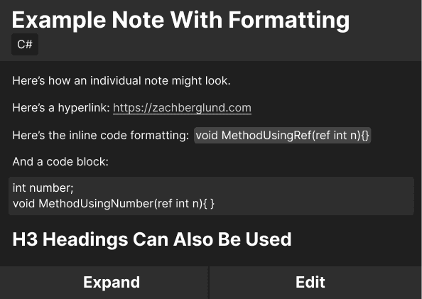
A rough mockup of an individual Note separated into a title section, a body section, and an actions section. The title has the text 'Example Note With Formatting' as well as a smaller piece of text representing a Tag named C#. The body has a bunch of placeholder text showing the various text formatting available that includes hyperlinks, inline code, code blocks, and one size of heading. The actions section shows two simple buttons that have the text Expand, and Edit.
A highlighted view of an individual Note.

Self-Accommodations

The last, but not least of my requirements was presenting Notes with a look that I liked. I was very close to using Notion rather than making Dev Notes, as it had nearly every bit of functionality I would need. However, my desire to be picky with the visual aesthetic was strong enough to make my own tool. While this mostly boils down to my own subjective, personal preferences, I still want to share a bit about why I was getting so visually picky.


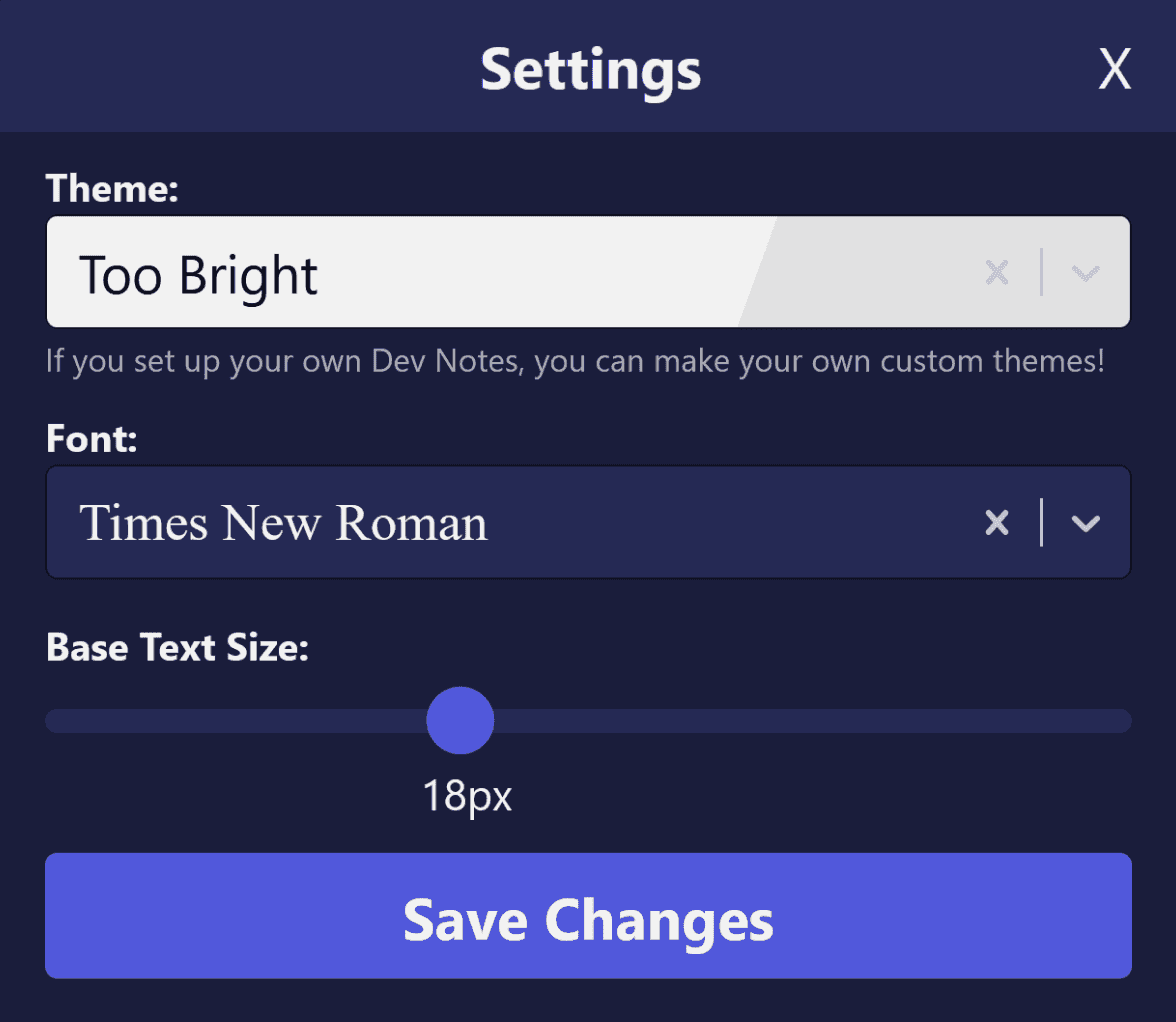
I typically use two monitors, and I like to keep something visually calm and simple on my secondary monitor when I'm not actively using it. I'm very sensitive to light and color, so leaving something that's brightly-colored or generally distracting on my secondary monitor can quickly overwhelm me. I was really hoping to make Dev Notes my new glorified desktop background for my secondary monitor that conveniently has a lot more utility than a desktop background. And while I know in general what visual styles are the least distracting to me, I also know that I can change my mind on exactly what styles I prefer. To avoid incessantly making minor code changes to update the look of Dev Notes later on, I decided to plan out a small settings form to modify my colors, font, and text size within the application itself:
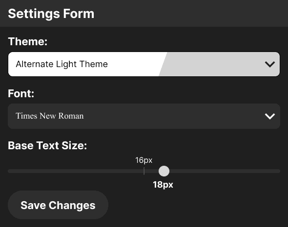
A mockup wireframe of a simple settings form with a select field for picking a color theme, another select field for fonts, and a slider field for setting a new base text size.

Results

In the end, I didn't make a lot of changes to the overall looks and functionality from the wireframes. The main changes I did make were either adjustments to specifically refine Dev Notes for myself, or flaws that became evident as I developed it. Here's how it ended up looking, along with some extra details pointing out some of the changes from the wireframes and why I made them:
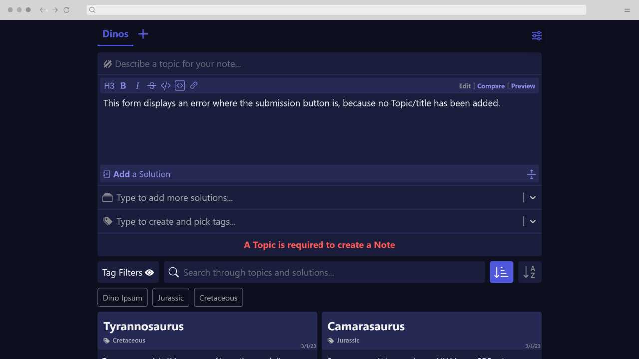
The front page of a Dev Notes instance with a basic header, a simple form, a section with a Tag filters and search, and two placeholder example Notes that had been saved below. The header has one link called Dev Notes. The form has one submission button and four fields: a basic text field called Topic, a larger textarea field called Solution, an autocompleting select field to add additional Solutions, an additional autocompleting select field to create or add Tags. The submission button at the bottom currently displays the error: A Topic is required to create a Note. Only the titles and Tags of the two placeholder Notes can be seen. One of which is Tyrannosaurus with the Tag Cretaceous, and the other is Camarasaurus with the Tag Jurassic.
As stated in this image, an error is displayed in the form where the submission button usually appears. Complicating basic form elements, such as removing field labels or combining errors with the submission button, is generally considered bad practice and an accessibility issue. However, I was able to safely make these changes without negatively impacting the user experience, because I had the rare benefit of knowing the entire userbase (myself).
Another view of the front page of a Dev Notes, this time highlighting three Tag filters, and four example notes. The Tag filters are Dino Ipsum, Jurassic, and Cretaceous.. All of the text in the Notes are randomly generated real and fake dinosaur names. Each of the four Notes are are roughly the same size, and they all look very similar to the wireframes described earlier. The only addition is a new middle button in the actions at the bottom of a note. This new button is an icon with an arrow implying to expand or collapse the note vertically. The only note out of the four that stands out in any relevant way is the first one, as it's the only one that has been vertically expanded, thus making it the longest
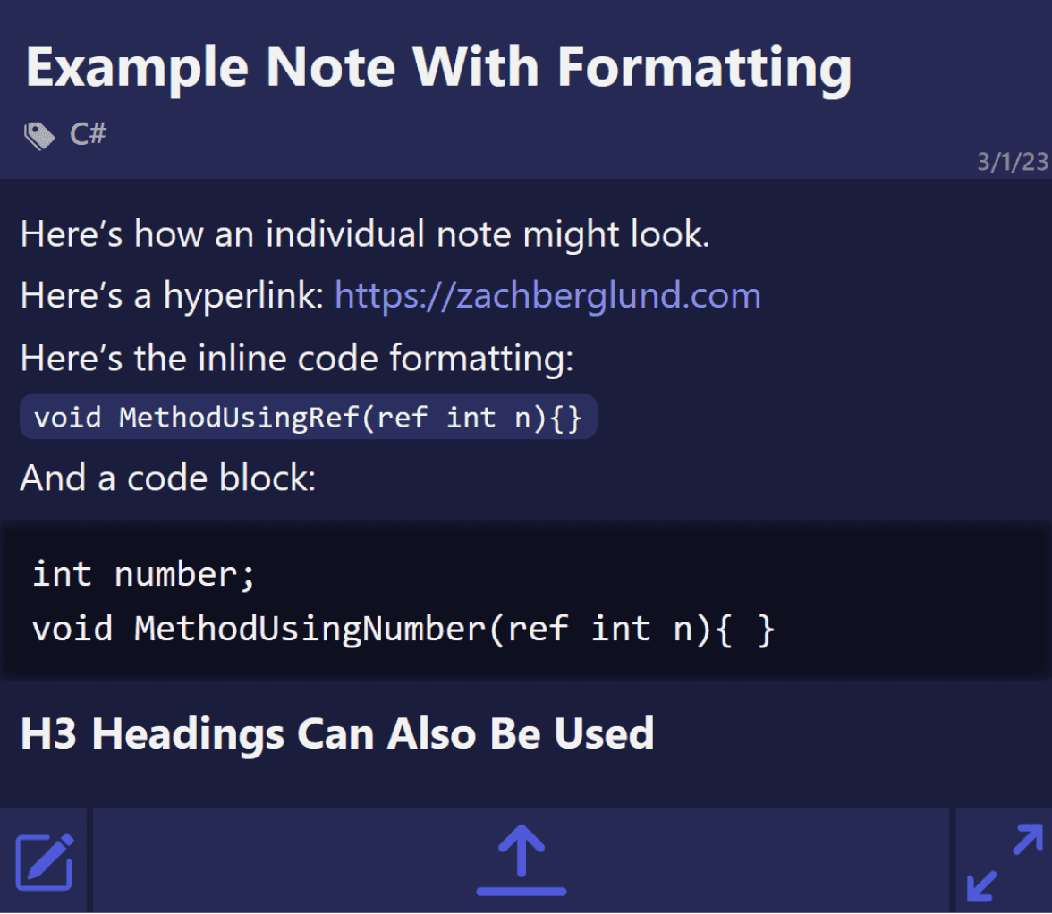
I added two buttons to adjust how Notes are sorted, as well as a separate Tag filtering component. Additionally, it quickly became clear that the heights of each Note needed to be limited to avoid hindering the ability to quickly look through Notes while searching. This is why the initial expand button was split into a more prominent vertical expand/collapse button (the center button at the bottom of each Note), and a full screen toggle.
The same example mockup of an individual Note but in its final form. It's separated into a title section, a body section, and an actions section. The title has the text 'Example Note With Formatting' as well as a smaller piece of text representing a Tag named C#. The body has a bunch of placeholder text showing the various text formatting available that includes hyperlinks, inline code, code blocks, one type of heading, and a basic list. The actions section shows two simple buttons that have the text Expand, and Edit.
Another view of the front page of a Dev Notes, this time highlighting the basic settings form. The form has a simple layout with a single submission button with the text Save Changes, as well as the following fields: A select field called Theme with a currently selected theme called Too Bright that's represented by the color white and a very light gray; An autocompleting select field called Font with the font Open Sans currently selected; and a slider field called Base Text Size with the input currently set to 18px.

Retrospective Thoughts

After using Dev Notes as a personal documentation tool for the past six months I can confidentially say I'm a fan. There are some elements I could refine here and there, but it ultimately improves on all the problems I set out to solve. Now I'll have to build a tool that — somehow — magically reminds me when I forget to document important findings…

© 2024 violet.eris.b.