RPG Accessibility (cont.)
/case-studies/Labours-of-a-Rising-Adventurer

- Game In Development
- Case Study Update, 2023
- ~10 Minute Read
- UI/UX Designer
- UI Programmer
- Game Designer
- Game Programmer
- Figma
- Photoshop
- Unity
- C#
Labors of a Rising Adventurer (LOARA) is my current personal project. It's a cross between the progression and familiarity of a retro turn-based RPG, and the absorbing thrill of a modern deckbuilder and/or roguelite. The added twist is that it's made entirely out of UI.
One of the main goals in my accessibility-focused case study for LOARA was to make the game less overwhelming, both cognitively and visually. Keeping that goal in mind, I wanted to answer two more questions:
- How can I communicate the game state, a.k.a. the turn order in a concise manner?
- How can I help the player remember (or learn) abstract details of the game?
Turn Order
The specific method of how turns alternate between the player and enemies can differ quite a bit between each turn-based RPG; sometimes the turn order is shown in a simple timeline, sometimes the player is given no insight into the following turns, and other times, there is hardly a notion of sequential turns at all.
I knew I wanted a system that followed a simple sequential turn order. However, based on previous design decisions I had made, giving the player the ability to see into future turns would trivialize certain mechanics. As a result, even though a timeline is a familiar and predictable method of presenting turn order, it gave too much information for my liking. However, the classic method of no turn display and simply giving the player control over when they act was also problematic; most games that use this method also have the visual assistance of combatants on a battlefield — something that is extremely limited in LOARA's UI-only style. While I could still make it work, I lacked the resources for a proper survey to explore the concern more. Therefore, I decided to come back to this after looking at my second question.
Mnemonic Device
In my experience, I could be 100+ hours into an RPG and still need my phone on-hand to quickly answer questions like:
- “Are lightning enemies are weak to ice in this RPG or was that the other one?”
- “Does the Green Blob enemy resist earth damage or was it wind damage?“
- “What the heck does that tiny icon of a red square with a down-arrow actually mean?!”
Just about every game will give you the answers to these questions with in-game tools like journals, bestiaries, and glossaries. However, I personally never find myself gravitating towards those tools when I need them. It's usually much easier to do a quick search on my phone than remember where the answer is within the in-game menus, and then have to navigate there.
Previously, I had already come up with a system to quickly find the answers to the questions above by simply right clicking or using a secondary input with a controller. However, that still didn't solve the issue of teaching the player that this system even existed. A tutorial would at least declare that the system exists, but that's hardly a reliable way to make it memorable. What would make a system more memorable is integrating it into the regular flow of gameplay. Lucky for me, I had just been brainstorming on another important system that this could fit into...
Putting It All Together
The solution to both of these problems came from one question: What if, instead of restricting the player's knowledge of future turns, that information was a resource the player could acquire? If that was the case, I could then present this information through the same system the player uses to figure out what the heck that tiny icon of a red square with a down-arrow actually means.
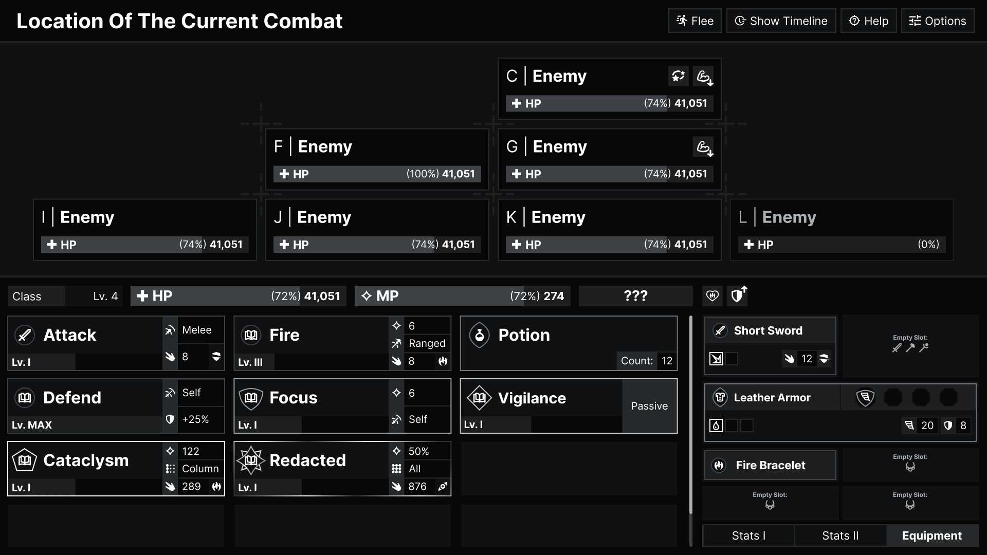
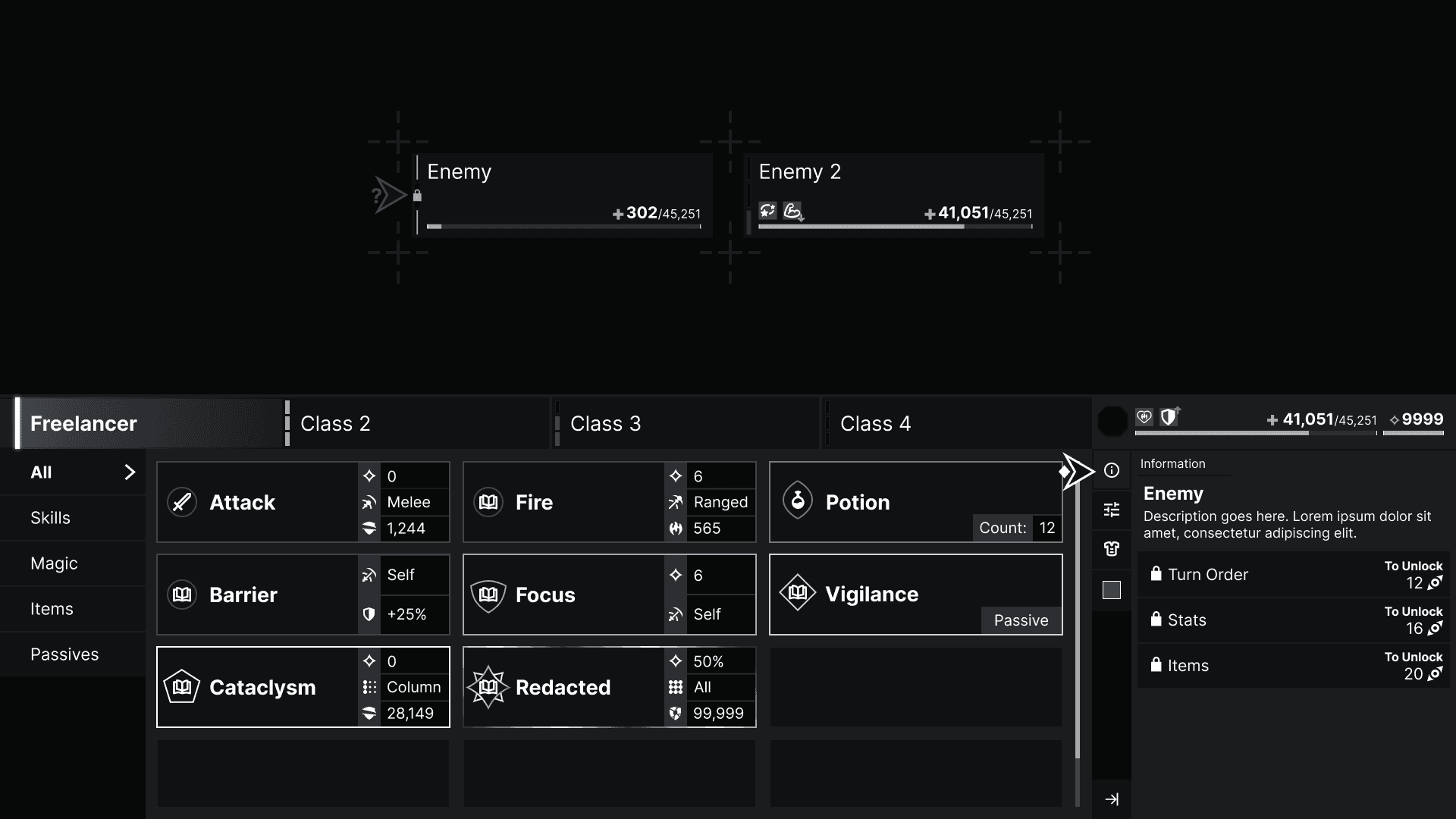
From there, I created a meter that incrementally fills as a combatant's turn nears and begins (Fig. 1, Fig. 2), and gave the informational system a permanent home on the combat screen (Fig. 3, Fig. 4):


Future Plans (cont.)
Obviously, “making the game” is an essential plan for LOARA's future, so my current plan is to stop planning for a bit and focus on development. That being said, accessibility isn't a binary goal that can be completed, so there's a few of the things relevant to this case study that I'm hoping to take a look at down the line:
- I want to take another pass at the action design with the goals of minimizing the initial information presented and making the interface as a whole feel less crowded. Something along these lines:

- I plan on spicing up the turn order meter down the line as well as making it more visually prominent.
- Usability testing! Of course, I can't really know if the ideas from this case study will actually accomplish what I hope they will without testing (this will obviously be a loteasier when the game is more playable).

