RPG Accessibility
/case-studies/Labours-of-a-Rising-Adventurer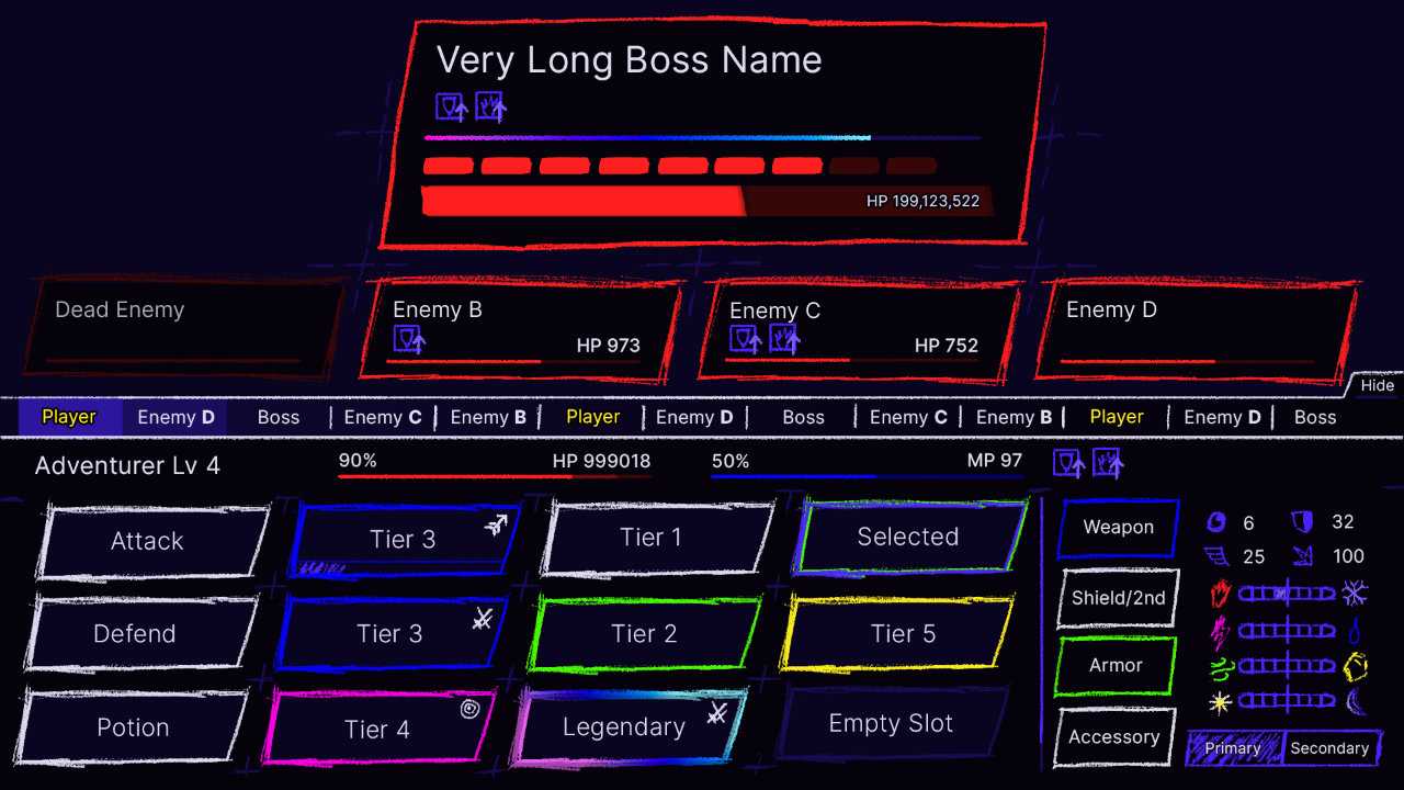
- Game In Development
- Case Study, 2022
- ~20 Minute Read
- UI/UX Designer
- UI Programmer
- Game Designer
- Game Programmer
- Figma
- Photoshop
- Unity
- C#
The Labour At Hand
Labors of a Rising Adventurer (LOARA) is my current personal project. It's a cross between the progression and familiarity of a retro turn-based RPG, and the absorbing thrill of a modern deckbuilder and/or roguelite. The added twist is that it's made entirely out of UI.
LOARA was initially a smaller game solely designed for myself, so I knew I'd have some pretty glaring accessibility issues to solve. This led me to take a step back from development and re-think my original mockup. I knew I'd need to take a look at how I used color, but I decided to do some initial research before determining what else needed the most work.
Research
Though I found many great sources along the way, I primarily gleaned applicable information from the following:
- W3C's Web Content Accessibility Guidelines (WCAG)
- Xbox Accessibility Guidelines (XAG)
- Game Accessibility Guidelines
- Can I Play That?
Microsoft's gaming accessibility fundamentals training also suggests a simple but insightful design principle that led my future decisions:
" Solve for one, extend to many "
To reflect that, I further narrowed my scope to find solutions that accommodate a few theoretical individuals with Color Vision Deficiency, ADHD, and Dyslexia.
Color Vision Deficiency
Unless there's some undiscovered individual out there that can read white text on a white background, everyone depends on contrast to perceive information; color vision deficiencies change how the affected perceive contrast. Fortunately, there are many methods to evaluate whether a design could be difficult to perceive for individuals with each of the broader categories of color vision deficiency.
Using some of these methods, I filtered my original mockup to simulate how it might display to individuals with protanopia, deuteranopia, or tritanopia to answer the following questions:
- Are important visual elements visible against their background?
- Are important game elements visually distinguishable from their counterparts?
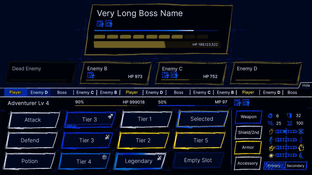
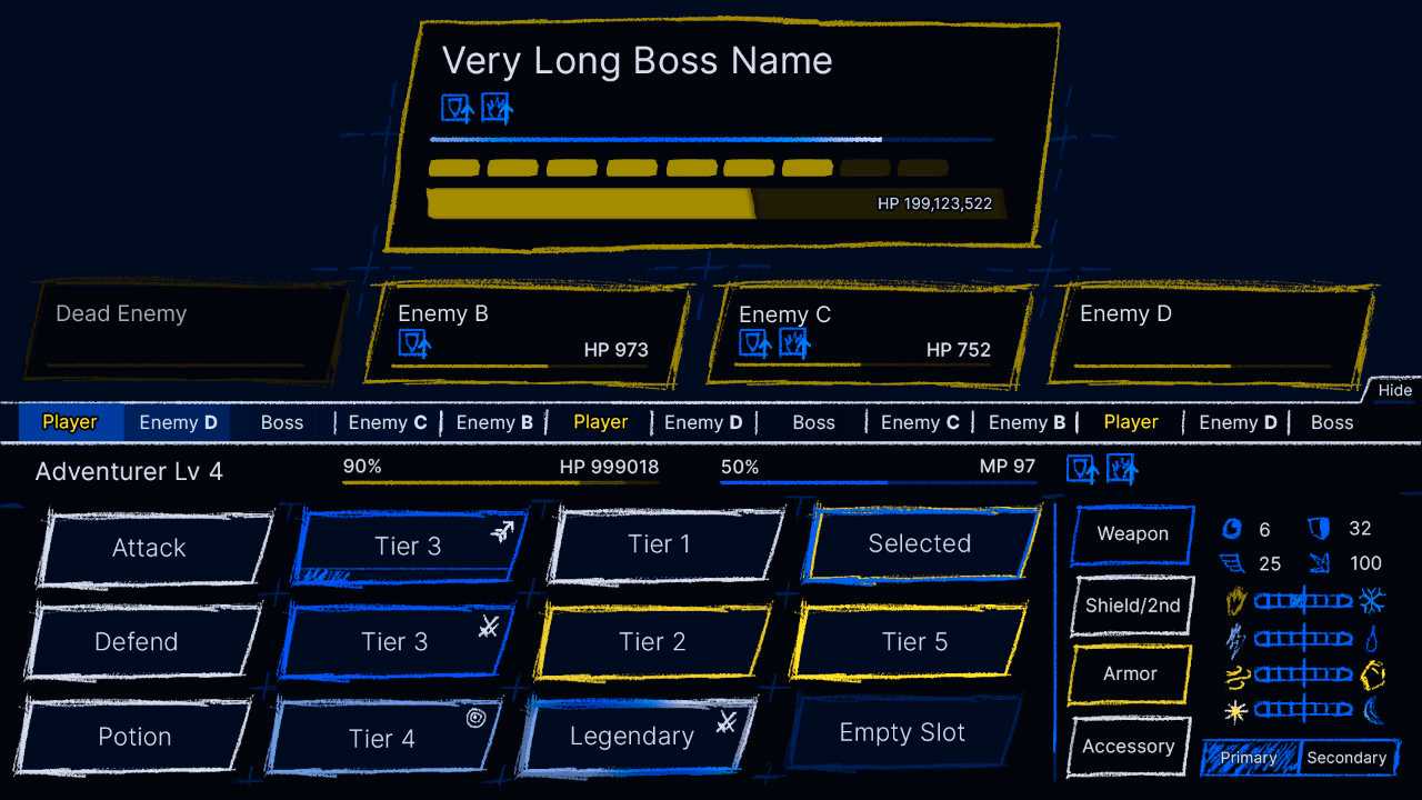
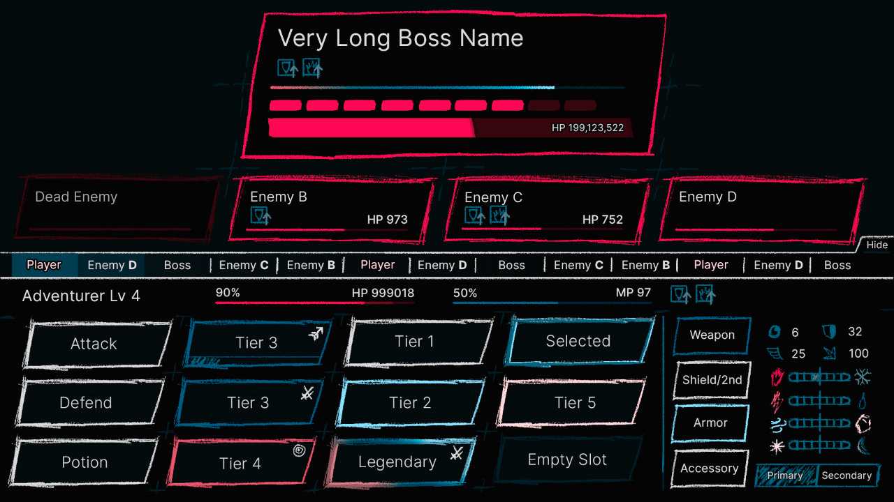
While contrast is not a problem in the majority of the design, colors are the primary means of notating rarity. In each of these examples the rarity colors are difficult to distinguish for many individuals with color visual deficiencies.
ADHD
Unlike color vision deficiencies, accommodating individuals with ADHD and Dyslexia (or any cognitive disability) can be much less objective, and thus, a lot more complex. I found that focusing on an individual with ADHD was too broad, so I further narrowed my focus to one way ADHD can affect a person: When a lot of information is presented all at once it can be a struggle to focus on any of it — especially when that information isn't presented in easily discernable patterns. I then broke down the original mockup into distinctive sections to answer the following questions:
- Do any of the sections present information that isn't immediately relevant?
- Is information presented in a organized and predictable manner?

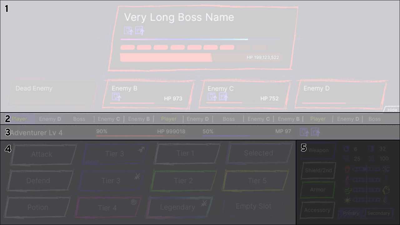
Overall, the information presented is rather essential to gameplay. That being said, I determined that the turn timeline (2), the player status section (3), and the equipment and stats section (5) are each secondary in relevance. I also found a few smaller scale issues, such as the visual distinction between player actions (4) and equipment (5) not being immediately clear.
Dyslexia
Similar to ADHD, Dyslexia still affects each individual in unique ways, but there are more concrete solutions to accommodate dyslexic people; I was even able to find more resources directly related to accommodating dyslexic people like this guide from the British Dyslexia Association. Applying some of these general concepts to my original mockup I wanted to answer the following question:
- Is text (and similar information like icons) size and alignment used predictably and effectively?
- Is varying text size effectively utilized in a clear and predictable manner?

The player actions and equipment use center-aligned text and I determined redesigning the actions starting with a left-aligned title would result in a more concise structure. The current text sizes also do a decent job at emphasizing more important information, but I did determine that revaluating what elements use which size of font (as well as including the occasional bold font-weights) would benefit readability.
Compiled Concerns
At this point I felt like I had more than enough to work on for this current phase. Here's a summary so far:
- Important game elements are difficult to distinguish for individuals with many different variations of color vision deficiency.
- The large number of distinct visual elements can be overwhelming.
- Text alignment varies unnecessarily, and text-size could follow a more unified pattern.
Action Plan
To address these concerns I decided I needed to do the following:
- Remove my dependency on color. This primarily meant I had to rethink how rarity was displayed on actions and equipment.
- Minimize and reorganize game information to be more unified.
- Give the player options to control what information and how much information is displayed.
- Restructure the actions and equipment with a left-aligned title and a simpler top-down format.
Results
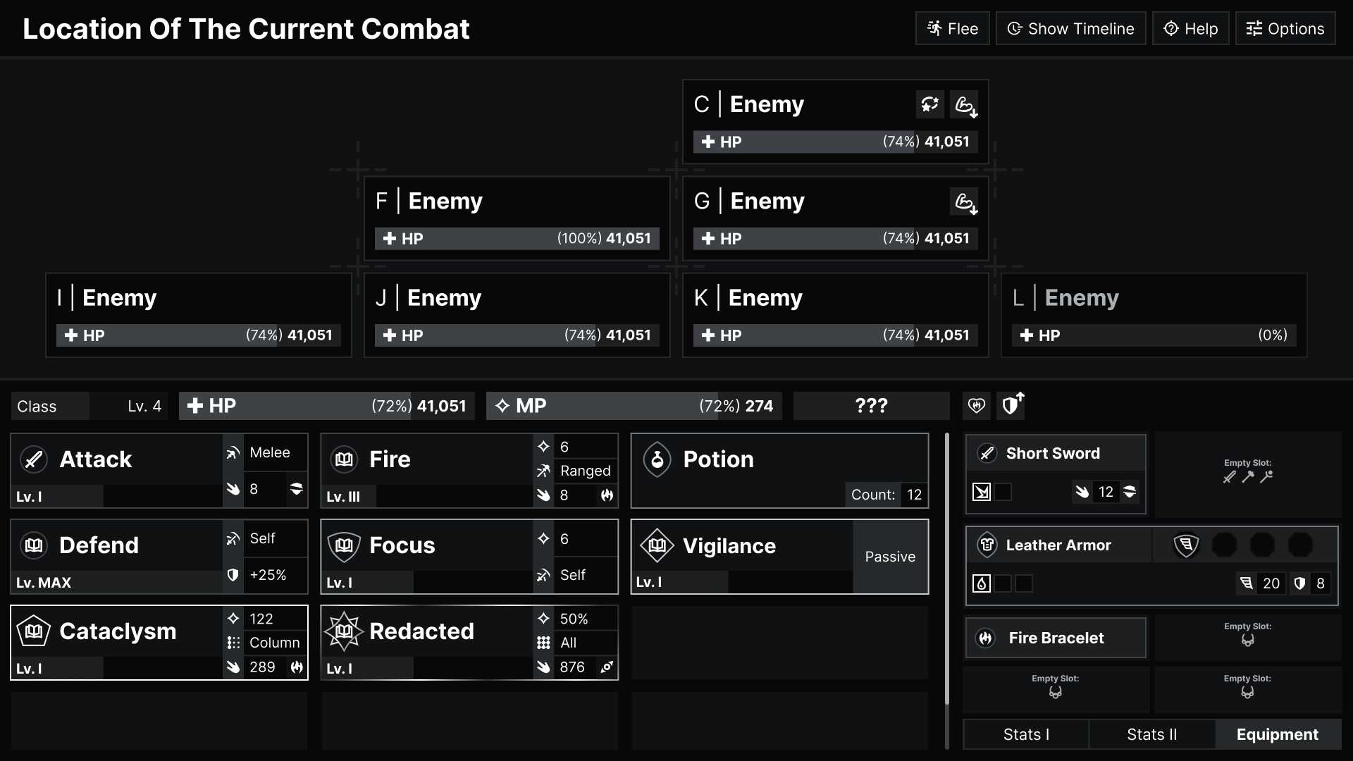
Here's the redesign I landed on, followed by some additional thoughts on what else I plan to include.

For this redesigned mockup, I decided to pull the colors back to a grayscale palette, because I wanted to make sure that as little information as possible was solely presented through color. The biggest issue in my original mockup was how rarity was presented, so I created these gem-like rarity markers to remove that dependency on color:

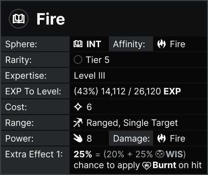
On top of the structural changes seen in the redesign (like equipment being its own sub-menu), I started building a new system to expand and minimize important game information. For example, the player can simply right-click/use a secondary action to expand a player action resulting in something like this:
Future Plans
Edit: I've now done a follow-up to this case study, so you can just look at what I did instead of read about what I hope to do: July 2023 Update
The turn timeline was brought up multiple times, but ultimately I decided to leave it out of these designs. Adjusting the turn timeline has a lot more game design implications that I wanted to explore further before spending a bunch of time redesigning it.
Another large topic that needs to be explored is how game state is communicated with the player. This was something I considered diving into for this case study, especially when considering an individual with ADHD, but ultimately decided it would be more effective to consider when I got around to…
…Usability testing! Perhaps one of the most important aspects of accommodating individuals is asking for thoughtful feedback from people. Once LOARA is developed to a more playable state, I am very much looking forward to getting more hands-on feedback and continuing to make LOARA as accessible as I can.